
Epidemiology — MCQs

On this page
A diabetic patient with COVID-19 dies in the hospital. Which type of surveillance does this death report fall under?
In a village of 100 children, 10 children have a past history of measles (i.e., they are not at risk now), 20 new cases of measles were reported this year. What is the incidence of measles in this population for the year?
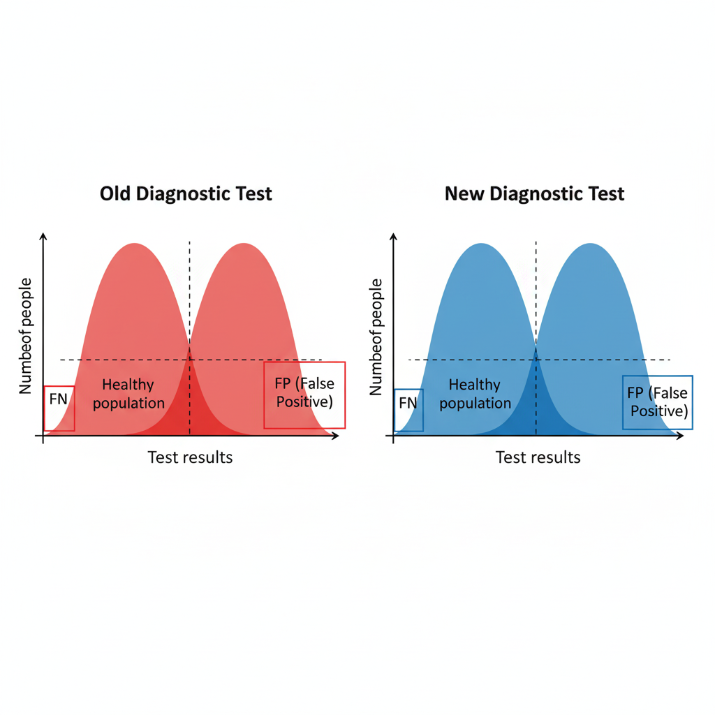
A new diagnostic test is introduced. Based on the provided images, what characteristics would be expected of this new test compared to the old one?
Identify the scientist shown in the image below:
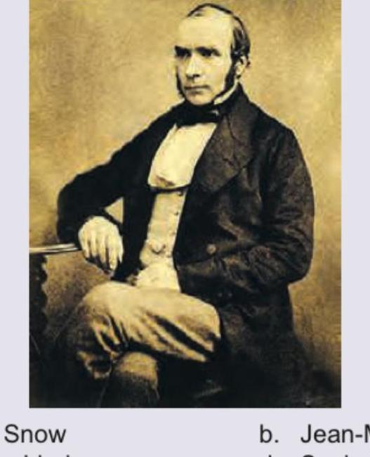
Identify the scientist shown in the image below:

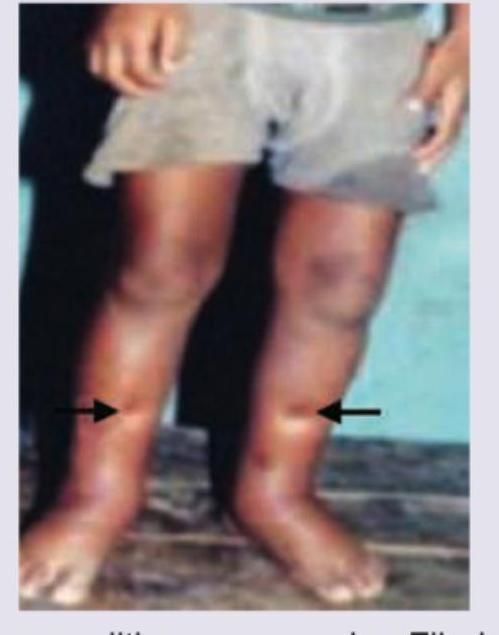
The medical officer at a PHC has seen a large number of cases with the following presentation in the last 6 months. Which illness should he be concerned about? (Recent NEET Pattern 2016-17)
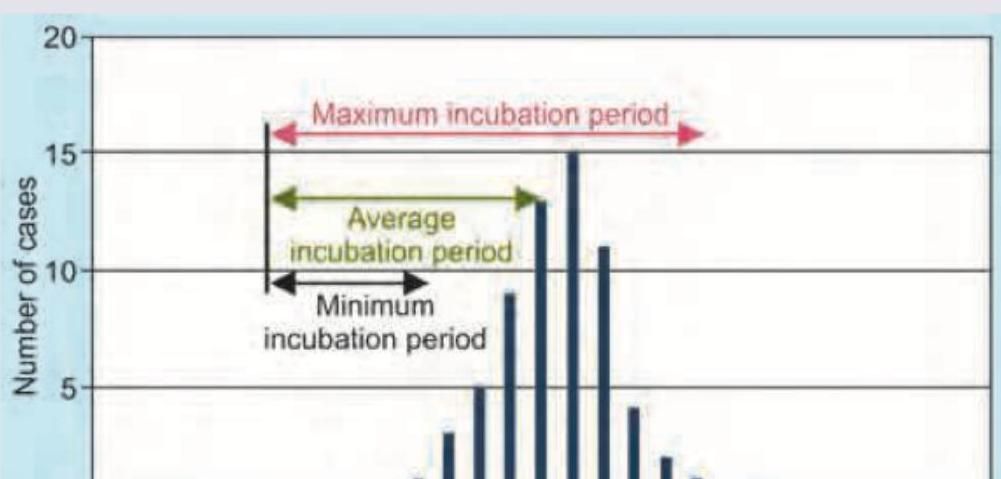
What does C in the given image denote?
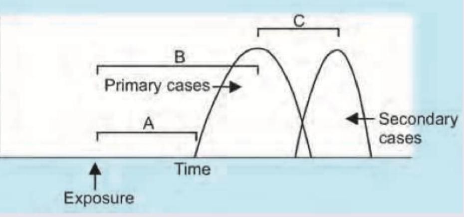
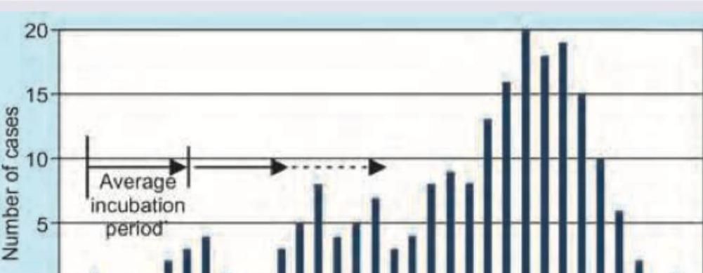
The epidemic curve shown in the image represents which type of outbreak pattern?
What does the given image show?
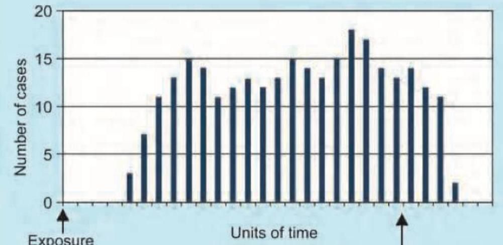
The given image shows which kind of epidemic?
Practice by Chapter
Principles of Epidemiology
Practice Questions
Measures of Disease Frequency
Practice Questions
Epidemiological Study Designs
Practice Questions
Descriptive Epidemiology
Practice Questions
Analytical Epidemiology
Practice Questions
Experimental Epidemiology
Practice Questions
Screening for Disease
Practice Questions
Surveillance Systems
Practice Questions
Investigation of an Epidemic
Practice Questions
Association and Causation
Practice Questions
Modern Epidemiological Methods
Practice Questions
Critical Appraisal of Epidemiological Studies
Practice Questions
Want unlimited practice?
Get full access to all questions, explanations, and performance tracking.
Scan to download app