
Biostatistics — MCQs

On this page
The following statistical diagram is called
What type of statistical display is shown below? ```text Test Scores Stem | Leaves -----|------------------ 5 | 2 4 7 9 6 | 1 3 3 6 8 7 | 0 2 5 5 8 9 8 | 1 4 6 7 9 | 0 3 5 Key: 5 | 2 = 52 points ```
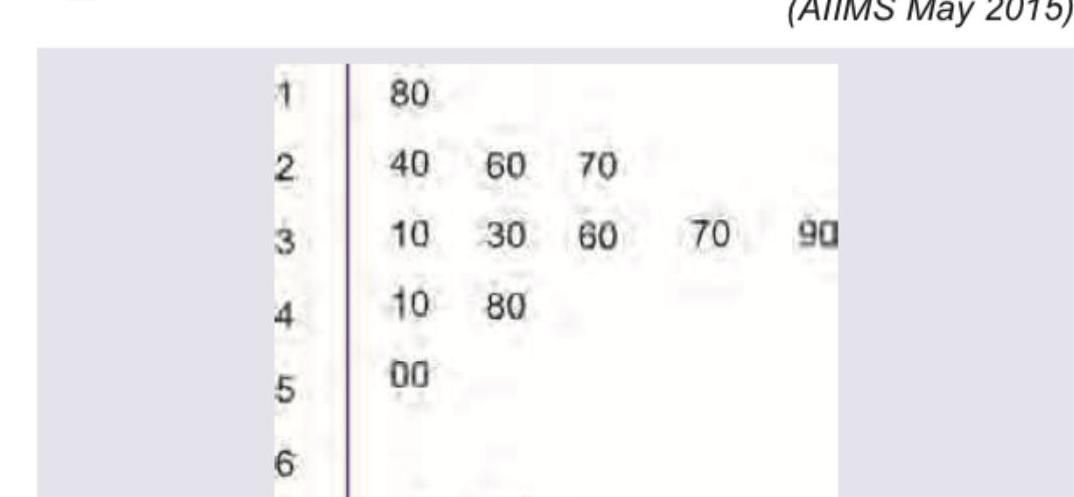
The following statistical diagram is known as
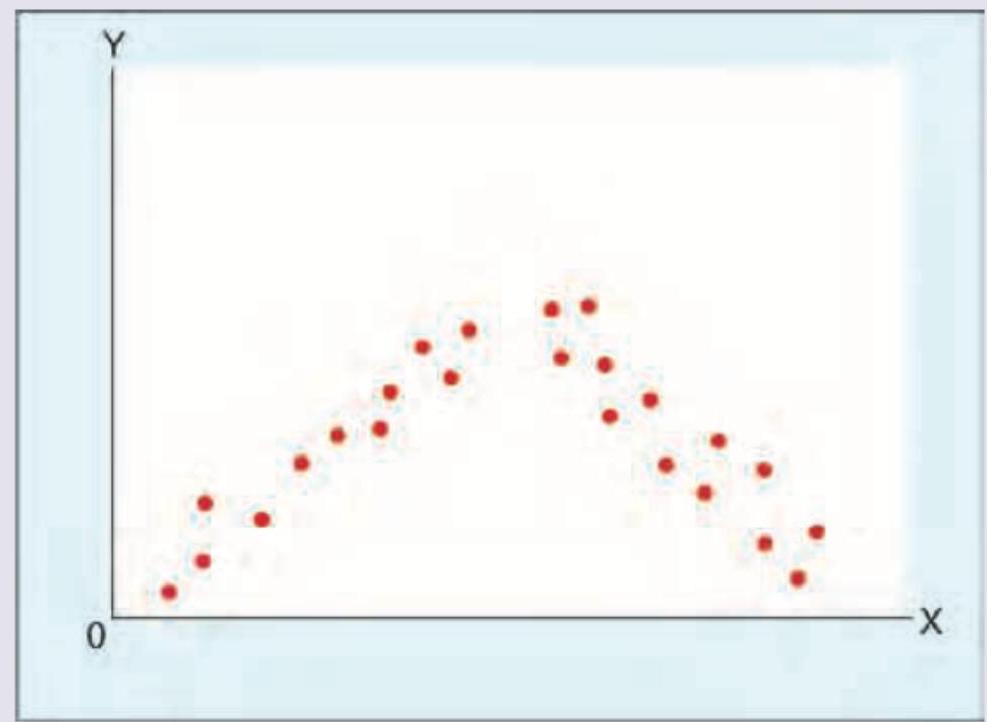
A scatter diagram is shown below between two quantitative variables. Which of the following is the correct interpretation?
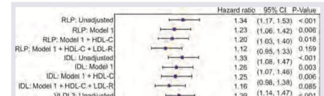
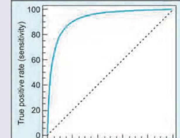
Two laboratories have developed testing for Zika virus. The statistical method shown below was used to compare the diagnostic performance of these tests. What is this statistical method called?
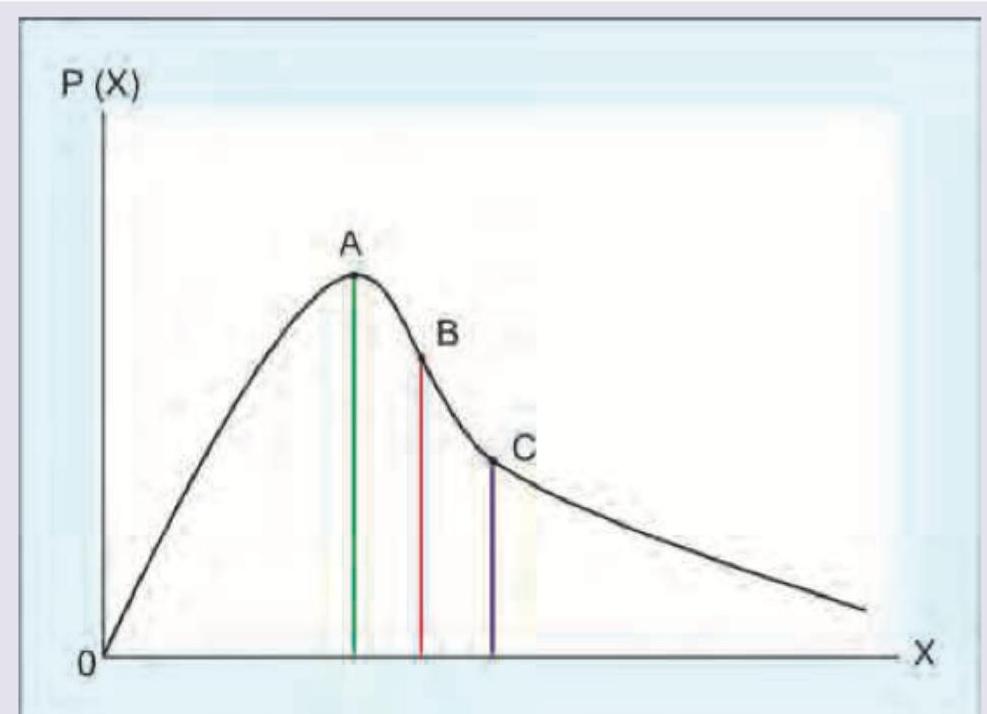
A study was conducted to find out the number of positive lymph nodes in a population of breast cancer patients who underwent axillary dissection. A graph as shown below was plotted between the number and frequency of positive nodes. Which of the following is correct?
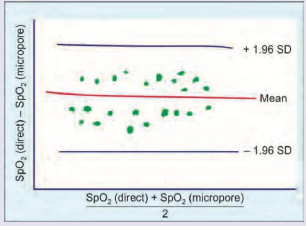
In comparison of pulse oximeter reading in neonates with and without micropore, which of the following is true about the plot shown below?
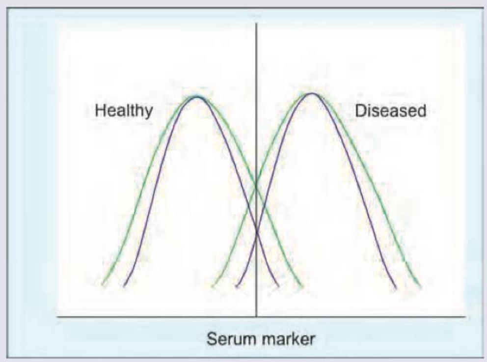
A new test (shown by the red-labeled curves in the graph) has been designed to diagnose a disease condition. The test is applied to both normal and diseased population, the graph of which is given below. Which of the following is correct regarding the test?
Sample size of samples A, B and C are 500, 800 and 1000 respectively. Which sample has the highest margin of error? (NEET Jan 2018)
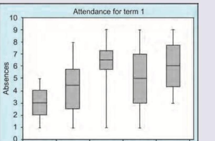
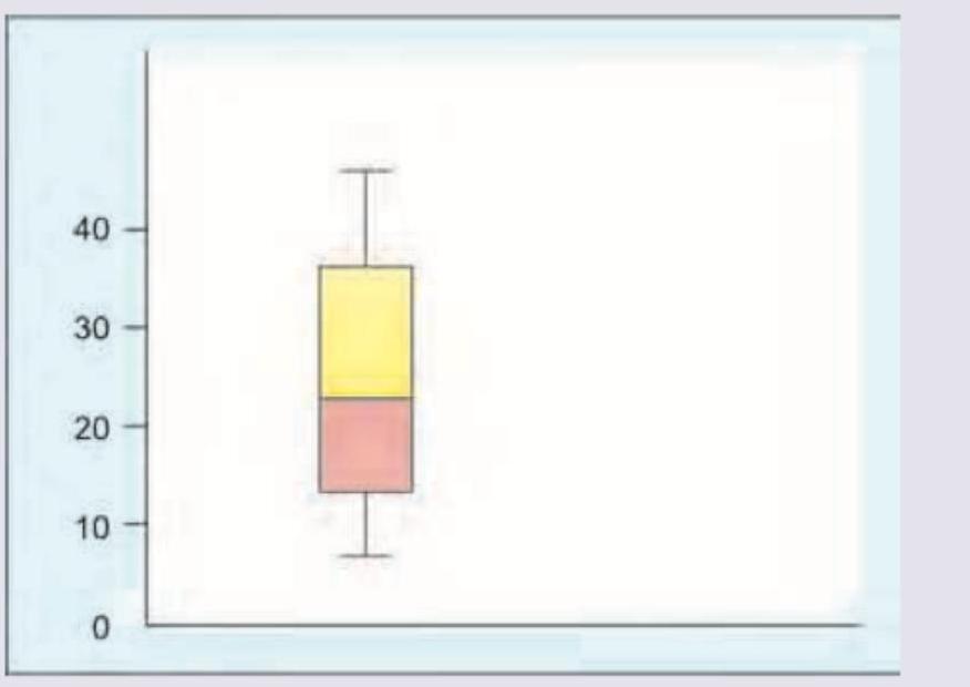
Which of the following is true about the box plot shown?
Practice by Chapter
Collection and Presentation of Data
Practice Questions
Measures of Central Tendency
Practice Questions
Measures of Dispersion
Practice Questions
Normal Distribution
Practice Questions
Sampling Methods
Practice Questions
Sample Size Calculation
Practice Questions
Hypothesis Testing
Practice Questions
Tests of Significance
Practice Questions
Correlation and Regression
Practice Questions
Survival Analysis
Practice Questions
Multivariate Analysis
Practice Questions
Statistical Software in Research
Practice Questions
Want unlimited practice?
Get full access to all questions, explanations, and performance tracking.
Scan to download app